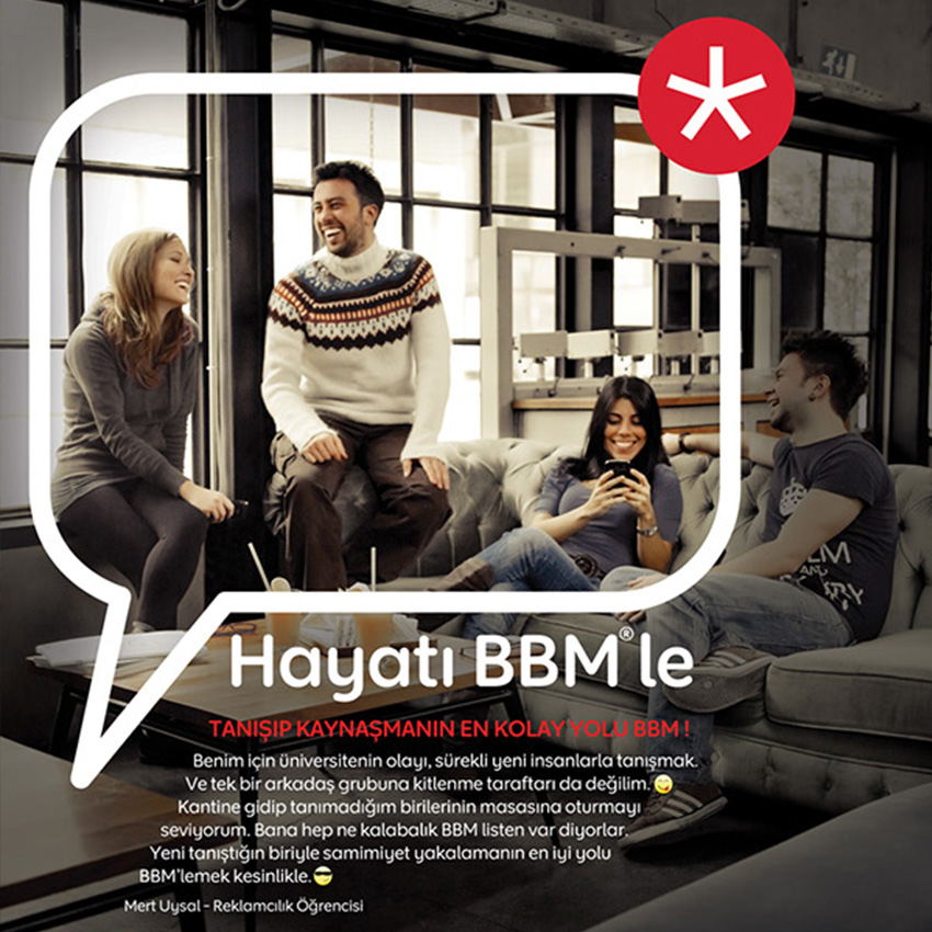
DIGITAL
BERLINER VOLKSBANK
I have been a frequent user of Berliner Volksbank website for many years. Although there have been a couple of changes in the past years, the website is still nowhere near living up to its potential in terms of user-experience. In order to be become friendlier for its users in the future, both layout and structure of the website need to be improved. In my opinion, the website could strongly benefit from the overall makeover and redesign.
Here is how I think it could be improved:
Overall redesign of the website for better user experience, a modern looking design and improved functionality.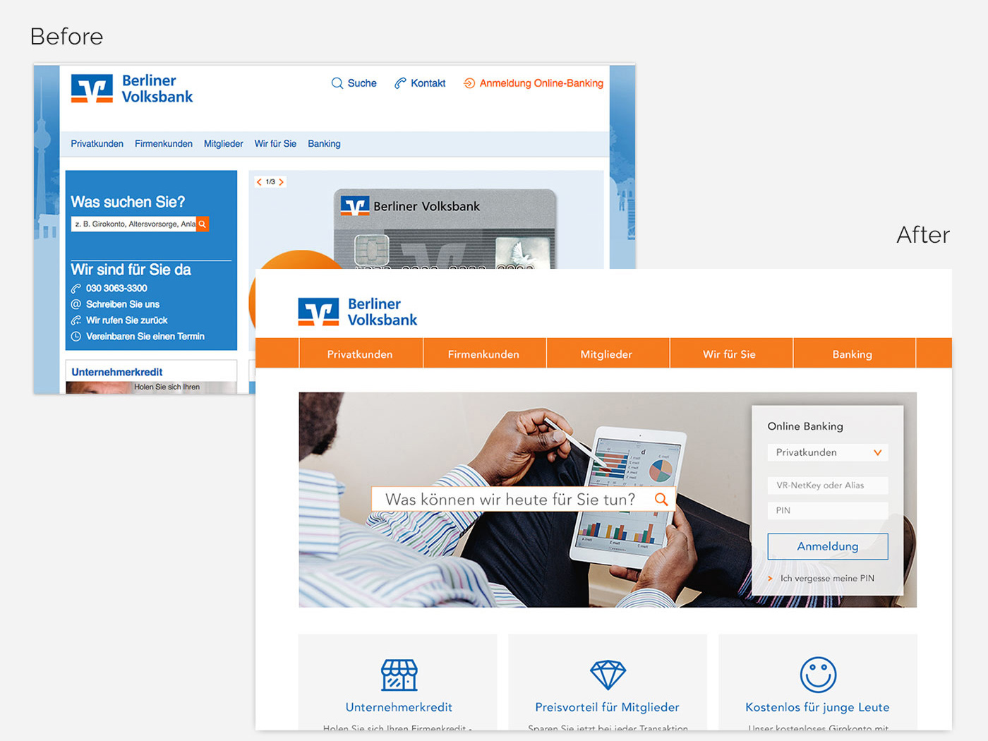
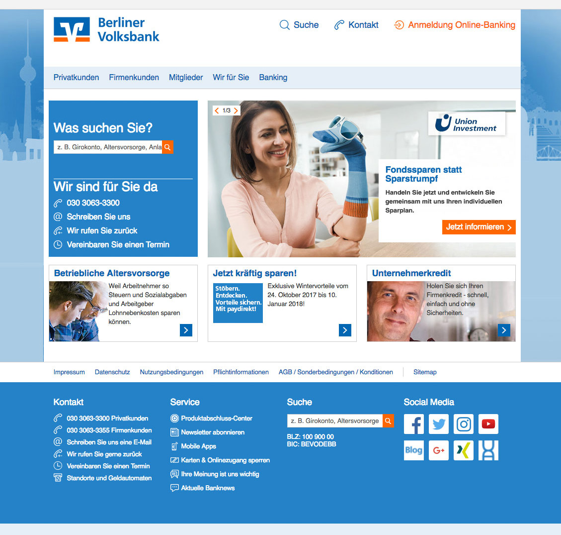
The Current Design
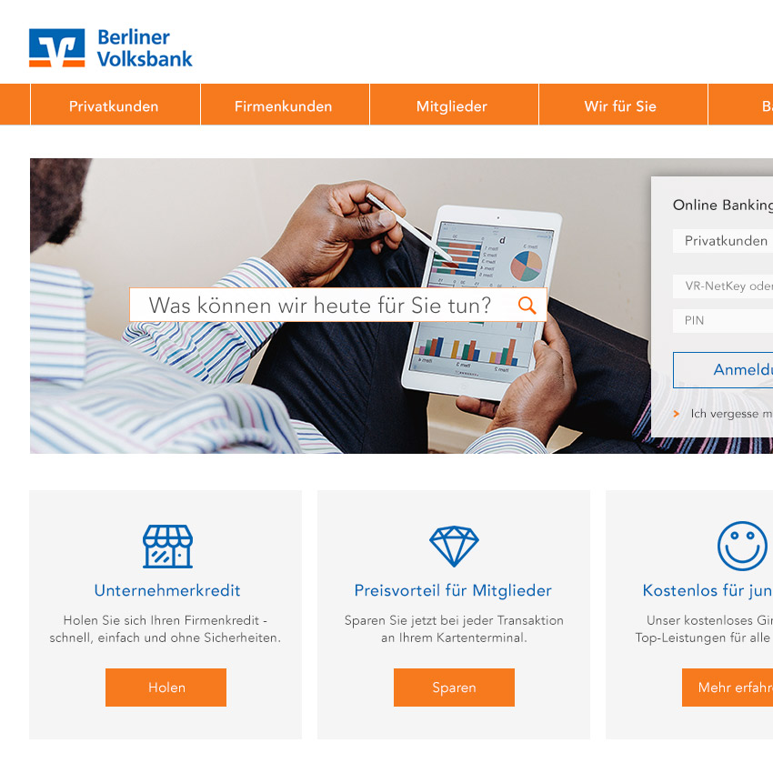
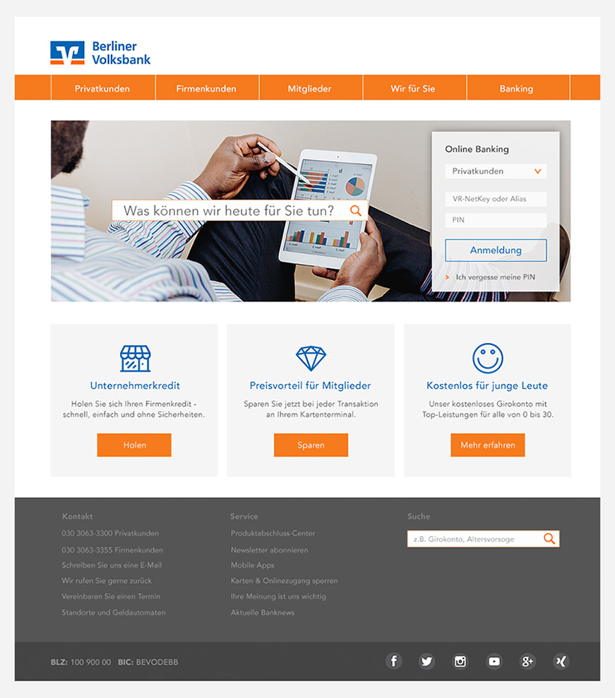
First we are going to be working on the UI design. Here’s what the existing design looks like:
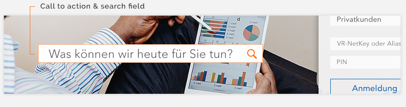
Call to action
On the main page I would suggest that search field section needs adjusting in an attempt to improve the customer experience. More specifically, a personal greeting in the SEARCH BAR such as ‘What can I do for you today?’ rather than the current ‘What are you searching for?’ would feel more personal for the customers and less robotic. The change would clearly set the Volksbank apart from its competition for prospective customers, who use less personal options. See further illustrations of this below:
A more spacious design of the main menu
I have found certain inconsistencies in the design of the links on the main menu. For example, it is not immediately obvious which links are clickable. This calls for improvement.
The way to implement this is by:
Changing the background colour to original Volksbank orange, making these links obvious ‘clickable’ areas with the help of short horizontal lines and increase the padding between the links to make them for spacious.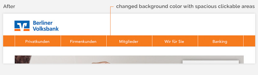
Sign in to Online Banking
With the current design, accessibility of signing in to online banking was an issue, because when clients want to sign in to online banking, they had to click on the “Anmeldung-Online Banking” and the popup window is shows up. On this popup window, they have to click “Private Banking” link, which leads them to the new page on their browser that they can finally give their online banking IDs and passwords to log in.
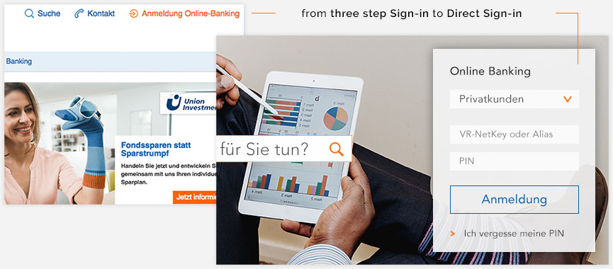
For the best user experience, it can be beneficial to show the actual sign in form on the home page itself. Merging the sign in form with the home page comes with a number of benefits in comparison to creating separate multi-page sign ins. We are cutting out extra steps from the flow in general and the task at hand takes less time.
Primary buttons
There are more design issues to discuss but there is one and last specific user experience failure I want to discuss is this:
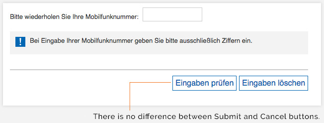
For me personally, as an experienced web user, so many times I failed and mistakenly clicked on the "cancel" button instead of "submit" button and it happened more than one. The reason of this misclicks, both cancel and submit buttons are in the same color and there is only 5px padding between them.
For my opinion, even without text labels, user should feel the difference:
For my opinion, even without text labels, user should feel the difference:
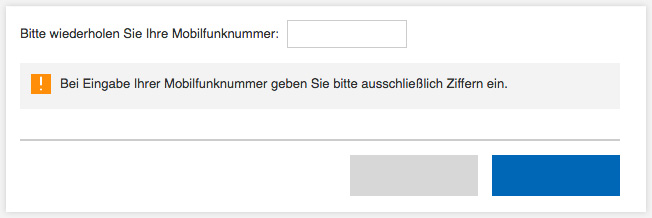
Primary action is not only stronger in colour and contrast, but also is on the right hand side of the dialog.
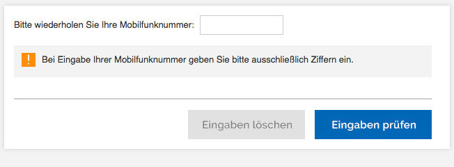
Final design
DIGITAL